How 2 Utah Independent Grocers Use Creative Store Designs to Stand Out


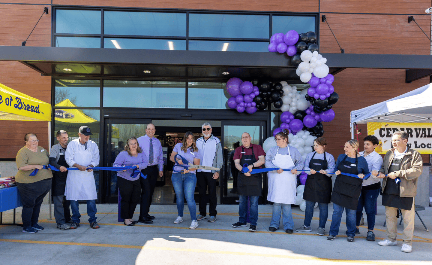
Last year, independent grocers Digby’s Market and Pioneer Market, both members of Salt Lake City-based Associated Food Stores, opened stores tailored to the particular needs of their respective communities in Utah. Both stores also feature novel design elements that help set them apart from competitors.
Digby’s Market, located in St. George, is a ground-up 40,000-square-foot store at 1955 Snow Canyon Parkway.
“First off, we wanted to create a bright, fun and inviting store to work and shop,” says Tim Rigby, who owns the store with Gregory Daines. “We wanted to bring in local colors and create that old-style grocery shopping experience.”
Cedar City, Utah-based Decorworx was key to creating the atmosphere that Rigby and Daines wanted in their inaugural Digby’s Market location.
[Read more: "EXCLUSIVE: L.A. Grocery Entrepreneur Shares Her Fresh Take"]
“For Digby’s, we had a partner who had a clear vision for the design they wanted to achieve,” notes Decorworx VP Tenia Wallace. “They provided us with inspiration photos and ideas that served as the foundation for our collaboration. We carefully examined the demographic information provided to us, such as age groups, interests and preferences. We also conducted additional research to gain a deeper understanding of the target audience’s behaviors and expectations. This analysis allowed us to identify key elements that would resonate with the intended demographic and create a design strategy that would effectively engage them.”

Local and More
One factor that definitely resonated with the store owners was local.
“We tried to use many local products in the building — block from St. George, trestlewood planks from Lindon, and many more,” says Rigby. “We wanted to accent the products that were going to be in the store; our Better in Utah brand is one of those. We built a front counter and made the Sweets & Treats area incorporate these hyperlocal Better in Utah products.”
Wallace points out that “we knew we were working on a design that aimed to showcase the unique characteristics of the southern Utah region. We conducted extensive research on the region’s natural resources and materials that are native to southern Utah. We explored the geological formations, the flora and the cultural significance of the area. We carefully selected elements that would showcase the uniqueness of southern Utah while aligning with the overall aesthetic and functionality of the project.”
Another key element was an inviting yet convenient layout.
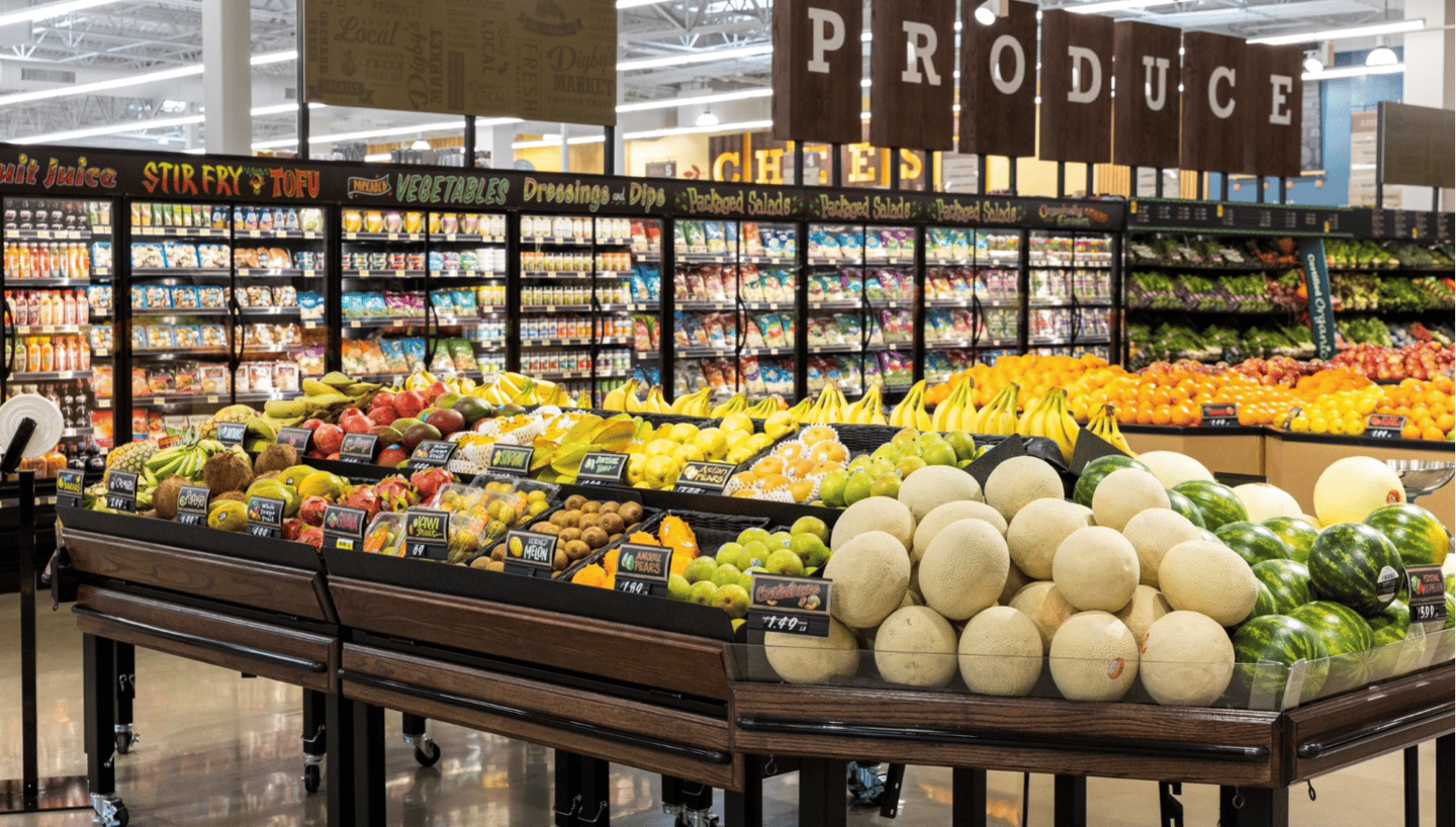
According to Rigby, “We also wanted the store to look timeless, so we incorporated different wood finishes, colors that were in the natural area around us, all while featuring each department separately but cohesively, making the guests’ navigation of the store easier.”
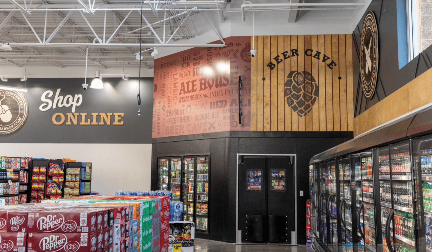
Asked how the store design came together, he recounts: “We researched pictures and magazines and visited many other stores. Some ideas even came out of past Progressive Grocer magazine issues! … We brought in different elements such as wood, metal scaffolding, skylights, light boxes, and texture from wallpaper. All this makes it a unique and exciting store to work and shop.”
“We brainstormed creative concepts that balanced the partner’s ideas and the demographic data,” adds Wallace. “We explored various design approaches, considering elements such as color schemes, typography, imagery and layout. We presented visual mockups and prototypes to illustrate our proposed design strategy, seeking feedback and input from the partner throughout the process.”
A collaborative approach, with Decorworx providing regular updates on the design progress and seeking Rigby and Daines’ input at key milestones, resulted in what Wallace deems “a visual design that successfully combined the partner’s original ideas with the insights derived from the demographic data. The design not only resonated with the target audience, but also effectively communicated the partner’s message and achieved their objectives.”
‘Artisanal Touch’
Among the more novel aspects of the design are the use of large routed sho sugi ban signs, which, Wallace notes, “are truly remarkable and add an incredible aspect to the overall aesthetic.”
She explains: “Sho sugi ban is a traditional Japanese technique of charring wood to enhance its durability and create a unique textured surface. When combined with the routing technique, it elevates the signs to a whole new level of visual appeal. These signs not only serve a practical purpose of providing information or wayfinding, but they also become focal points within the space, commanding attention and creating a sense of intrigue. The use of sho sugi ban brings a natural, earthy element to the design, connecting it to the environment and evoking a feeling of warmth and authenticity.”
Wallace also notes that “[t]hroughout the design process, we collaborated closely with our craftsmen, leveraging their expertise in working with these materials. Their insights and techniques not only ensured the proper utilization and preservation of the materials, but also added an artisanal touch to the final design.
Of course, there were bound to be difficulties. Rigby notes that “our biggest challenge was we knew what we wanted, but [translating] it to the computer and then to the actual building was a challenge. Decorworx really walked us through it and helped us build the vision boards and find the right materials and styles that would be cohesive throughout the store. They used the style of the outside of the store, designed by Design Sequence out of Salt Lake City, and made a cohesive style inside and out.”
Given the tendency for setbacks to occur, Wallace identifies the need for flexibility as imperative. “In many cases, there are fixed deadlines associated with events like grand openings, where the completion of construction is crucial,” she observes. “Flexibility plays a crucial role in adapting to unforeseen circumstances and evolving needs.”
As for how costs were managed, Rigby notes, “Keeping our initial budget on the conservative side, we were able to change and add some elements which were more in cost, but that gave us the allowance to make those adjustments.”
Regarding additional stores under the Digby Market banner, Rigby is noncommittal but offers some tantalizing ideas.
“This is our first store, and we are very excited to have it up and running,” he says. “Right now, we are focusing on this store, but who knows what the future holds for Digby’s Market? If and when we decide to expand, we will try to keep the style similar, with minor updates that would enhance the original designs, keeping us still fresh and unique. Location would have some effect on design, as we have some designs that feature our local area … so we would try to utilize other local landmarks in other stores, as well as other local products, keeping the community interests and natural elements in mind.”
Original Inspiration
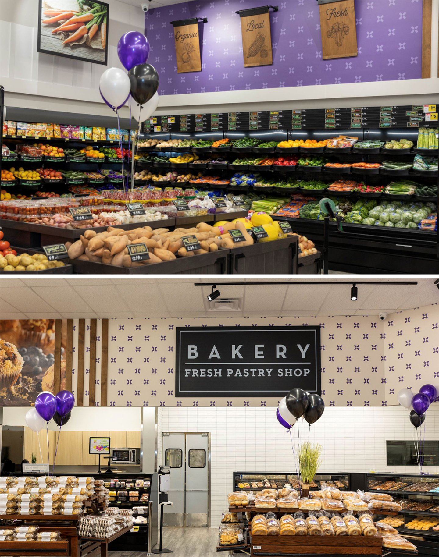
Meanwhile, Pioneer Market, located 300 East Main Street in Lehi, is a 21,000-square-foot store that originally opened as Pioneer Market back in 1969 and underwent numerous name changes throughout the years, most recently operating under the Kohler’s banner.
When contemplating changes to the existing store, owner Cecil Shern turned to his shoppers.
“I informally polled probably 40-50 of my customers to see, one, what they liked about my store and, two, what they would change to improve it,” he recounts. “The things they would change varied a lot from customer to customer, and I couldn’t believe it, but over 90% had the exact same answer for what they liked, and [for] the other 10%, it was their No. 2. The biggest thing they liked was the ‘hometown feel.’ So I did everything I could to preserve the hometown feel, while replacing and renewing also. I think that is where the wood look came into play in so many of our decor decisions, also the picture of Lehi Main Street from the 1890s that is featured in our front vestibule. We also added ‘Hometown Grocer’ to our logos.”
As for adopting the store’s original moniker, he notes that it “took on a family name in 1982 and kept some version of that family name until 2023, when we decided, since none of the family members had any stake in the business anymore, to change it back to its original Pioneer Market [banner] again.”
“Pioneer” is more than just the store’s name, though — the word has a deeper meaning for the community.
“The mascot of Lehi High School is the Pioneers, and their colors are black, white and purple,” explains Shern, “so that became the inspiration for the [store’s] colors.”
Shern has definite ideas about the concept and design of any future stores.
“I might use ‘Pioneer Market’ again in Utah, because I really like the name,” he says. “The industry research on using the color purple is not terrific, but it works really well in this instance and could be used again anyway. I would definitely go for a hometown feel on any store less than 35,000 square feet. Anything over that, I feel that the sheer enormity of the store already detracts from a hometown feel, so it would be useless to attempt.”


