Spangler Rolling Out Updated Dum Dums Packaging
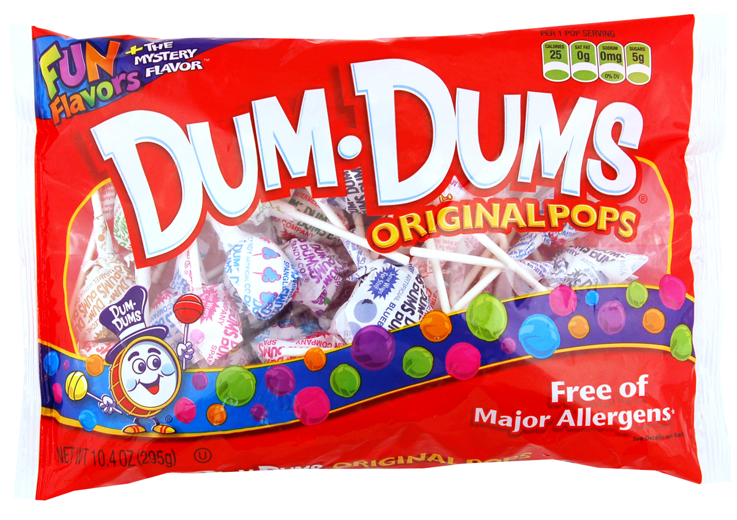 Dum Dums, manufactured by the venerable Spengler Candy Co., has embarked on a package graphics transition that will wrap up in mid-2012. The refreshed artwork features a new logo and graphics to emphasize the iconic brand’s core attributes of flavor variety, value and fun, while new package art introduces a modern look without forsaking the product line’s heritage.
“It is important to stay current with our graphics but retain the Dum Dums look,” noted Jim Knight, VP-marketing at Bryan, Ohio-based Spengler, which has been in business since 1906.
The new logo elevates the Dum Dums brand through a brighter, bolder appearance, with the word “Pops” moved from being part of the logo to a descriptor roll on the packaging. These changes position the brand for further growth, according to the company.
Also incorporated in the new graphics are front-of-pack nutrition labeling, improved allergen-free labeling, and a list of usage occasions on the back of the pack.
The updates are first significant change in Dum Dums’ package graphics in more than a decade. Cincinnati-based brand strategy and package design agency Fisher Design developed the new artwork with Spengler’s marketing department, employing a multiphase process that also included input from sales, production and quality assurance.
Among Spangler Candy’s other product lines are Saf-T-Pops, Circus Peanuts and Marshmallow Treats, Spangler Candy Canes, and Valentine, Easter, Halloween and Christmas products.