What Are the Hallmarks of Effective Supermarket Signage?
When it comes to identifying the trends that food retailers should heed with regard to impactful in-store signage, no one has their finger on the pulse more than Eugene, Ore.-based King Retail Solutions (KRS), which provides retail store design, manufacturing, distribution, installation and complete program management services to local, national and global clients. As the company points out in one of its online posts on the topic: “Modern grocery signs [are] increasingly leveraged to enhance the customer experience.”
[RELATED: 7 Must-Know 2024 Retail Design Trends]
To find out more about how food retailers can ensure that their in-store signage is doing all that it should do, Progressive Grocer reached out to KRS Creative Director Seth Maddox.
Progressive Grocer: What are the hallmarks of effective supermarket signage?
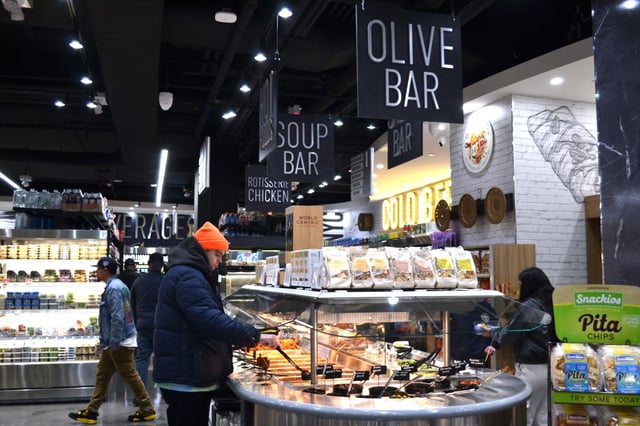
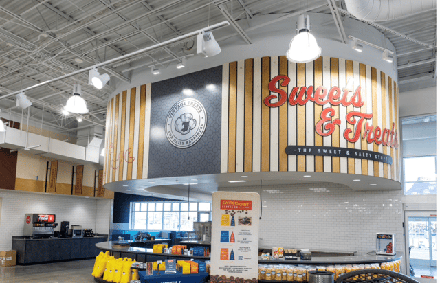
Seth Maddox: Effective signage should include clear wayfinding, visually engaging designs and a strong connection to the overall brand. Additionally, the signage should provide clear information, be accessible to all customers and maintain consistency with the design throughout the store.
PG: How can digital signage reach shoppers in a way that traditional signage can’t?
SM: Unlike traditional signage, digital signage captures attention with motion, can deliver more detailed information in a smaller footprint and allows for swift adjustments based upon the needs of the retailer.
PG: What are the most effective ways that a food retailer can deploy signage?
SM: Whether you work with an outside design firm or have resources in-house, thoughtful content creation is crucial. Specific signage categories should include wayfinding, promotional signage, menu boards (digital and/or static), seasonal, community boards, brand identity, and more. Once you have reached the point of deployment, considerations should include layout and placement, which directly impact material choices and durability needs. Proper installation, regulatory compliance and ongoing maintenance are important factors when selecting a firm that can execute and provide continuous support as the signage package evolves over time.
PG: What will supermarket signage solutions offer in the future?
SM: Supermarket signage solutions will evolve to incorporate more digital elements expanding their presence in shopping environments. That being said, this digital shift will make the presence of physical signage all that much more important and memorable. Interactive signage, including augmented reality, QR activation and mixed-media formats, will become increasingly prominent in supermarket design. These innovations will enhance customer engagement and create opportunities for personalized experiences.
- Supermarket Seafood Signs
At the recent Seafood Expo North America, held March 9-11 in Boston, seasoned retail seafood merchandisers spoke about the “art and science” of their field of expertise, and signage in this critical department naturally arose as a topic of discussion during the March 10 session.
Shawn Oliver, of Sugiyo U.S.A., noted that, for the rising number of seafood shoppers who are concerned about the sustainability of the product they buy, it’s imperative to display sustainability certifications at the point of sale. As pointed out later in the session, this encompasses the information that farmed fish is responsibly raised. Along with such certifications regarding eco-friendliness, impactful messaging identified by the panel included that the product was sourced locally and cooking directions for how best to prepare the item.
The panelists warned against too many signs, however, which could cause confusion or lead shoppers to tune out, as well as creating a cluttered appearance. Meanwhile, in the case of frozen seafood, Gavin Hatton, of U.K. organization Seafish, suggested promotional doors and end cap signage to help drive shoppers to these items, which are often overlooked by seafood purchasers in favor of more attractively displayed fresh product.
As Philip Walsh, of San Isidro Seafood LLC, wryly noted when discussing how to lure seafood shoppers to the frozen aisle: “Fresh is overrated.”


